NEST
Don't search for furniture - describe your space.
A mobile app for mindfully furnishing small spaces: the user sets the room's size and needs, and NEST puts together a matching set of furniture.
Furniture adapts to the space, not the other way round.
Instead of browsing furniture by looks, the user describes the space, its dimensions and their needs - and NEST suggests solutions that fit.
The project combines personal selection, functionality and a sustainable approach: furniture made from recycled materials and reused through NestLoop.
In regular stores people search through thousands of options and guess whether a piece will fit in size, function and style.
Hands-on
Active people who furnish or refresh their home themselves.
Mindful
They look for furniture that solves specific needs and is made with care for nature.
With constraints
They live in apartments of all sizes, each with its quirks and a lack of space.
Three steps instead of
a thousand options.
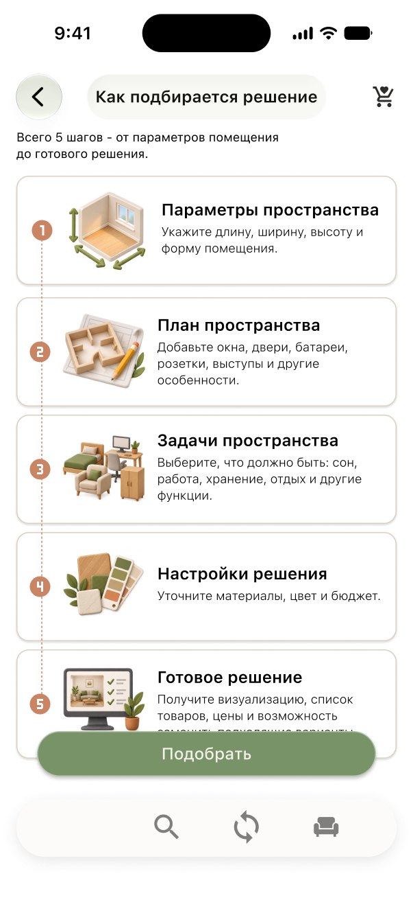
Room dimensions
The user enters the room's parameters: dimensions, shape, windows and doors.
Needs and scenarios
Chooses what matters: sleep, storage, work, rest.
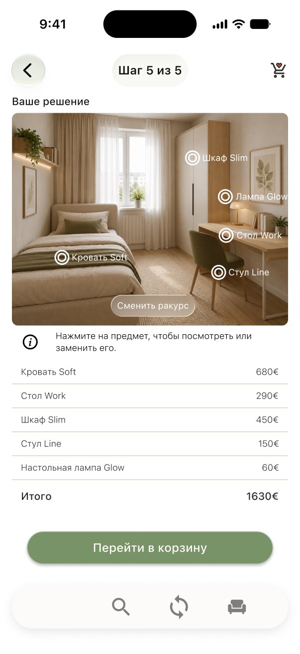
Ready-made solution
Gets a furniture set made from recycled and new materials.
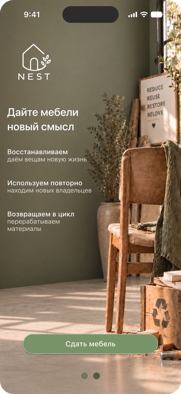
Nest Loop - a furniture cycle
Old furniture can be handed in through NEST: it gets a new life or goes to recycling.
Two scenarios -
one clear path.
Furniture selection
Nest Loop
What made it
into the MVP
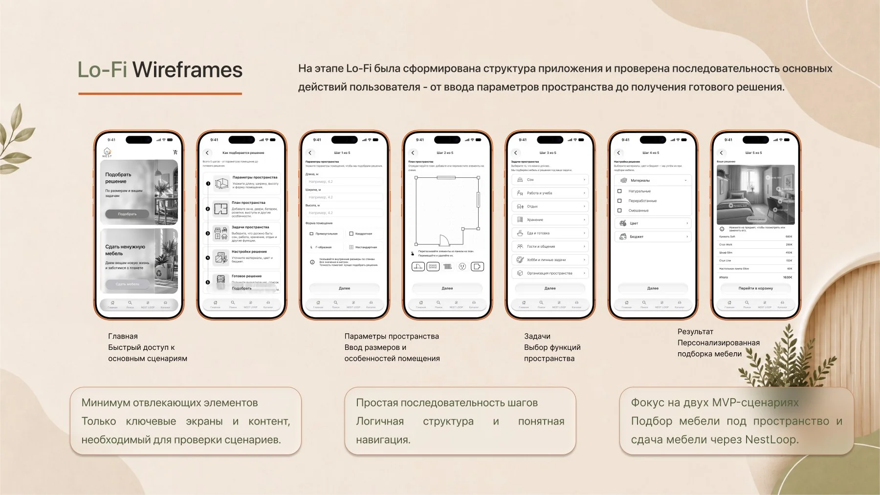
Structure first,
beauty second.
At the Lo-Fi stage I tested the sequence of actions - from entering the room's parameters to a ready-made solution. Only key screens, no decoration.
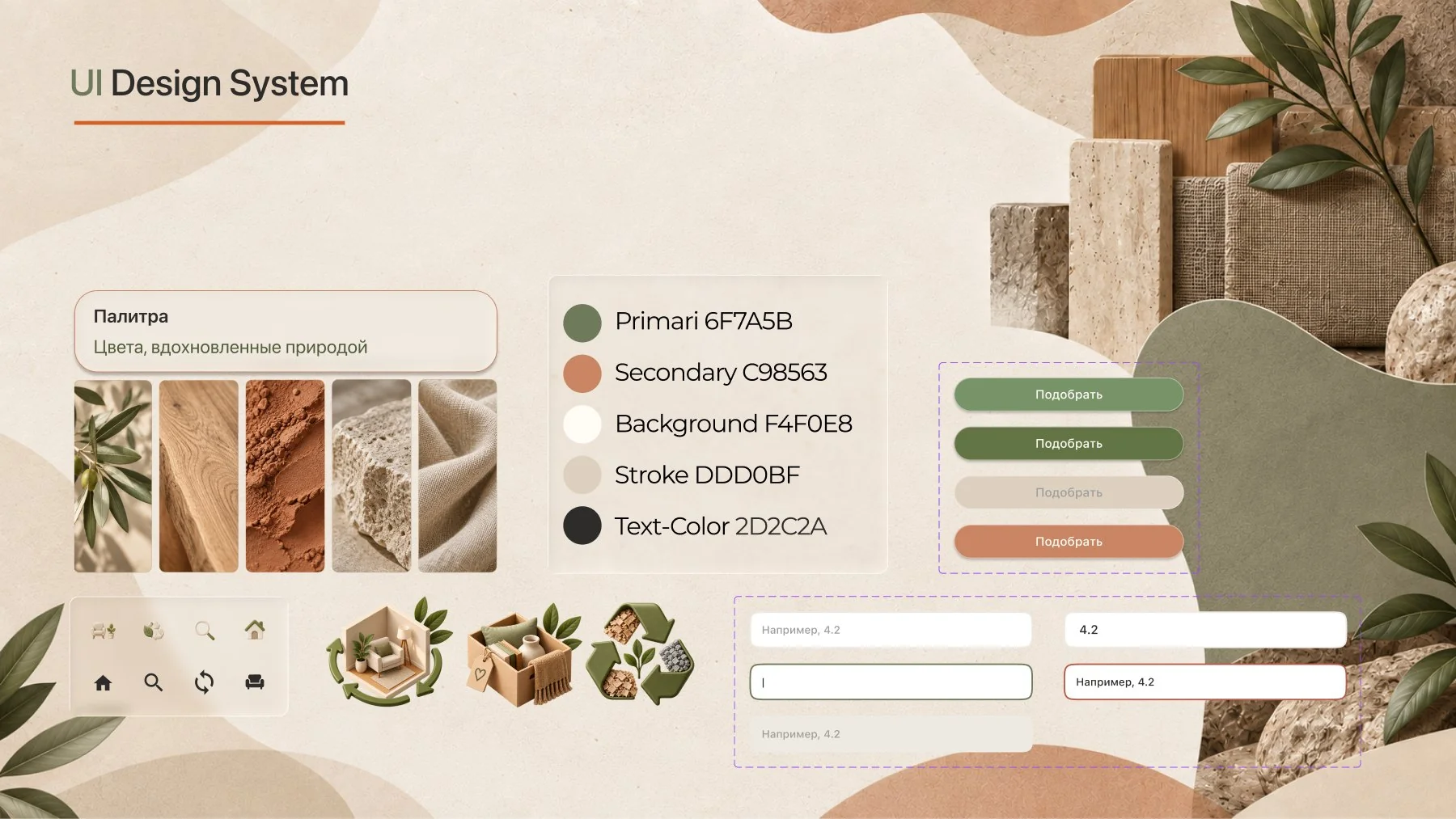
Nature inspires
the best solutions.
Calm warm tones and natural materials create a feeling of comfort, trust and mindful consumption.
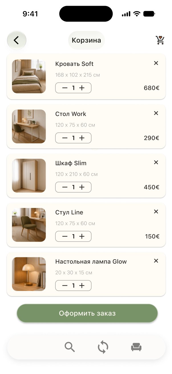
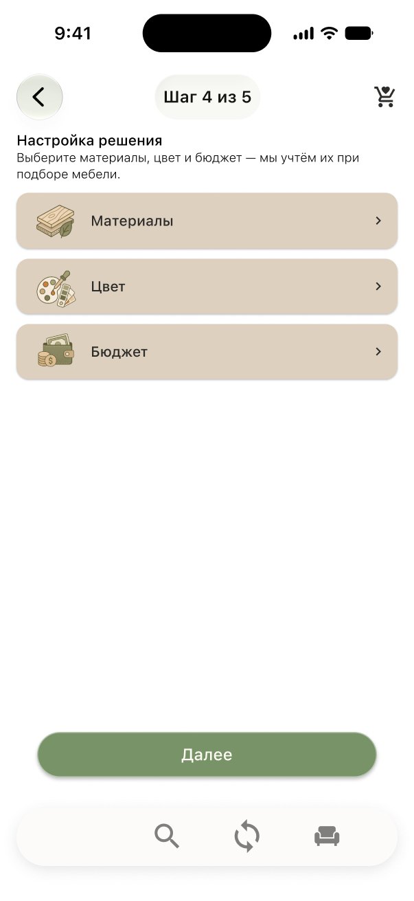
The whole journey in one strip.
The strip slowly scrolls left on its own and pauses on hover.
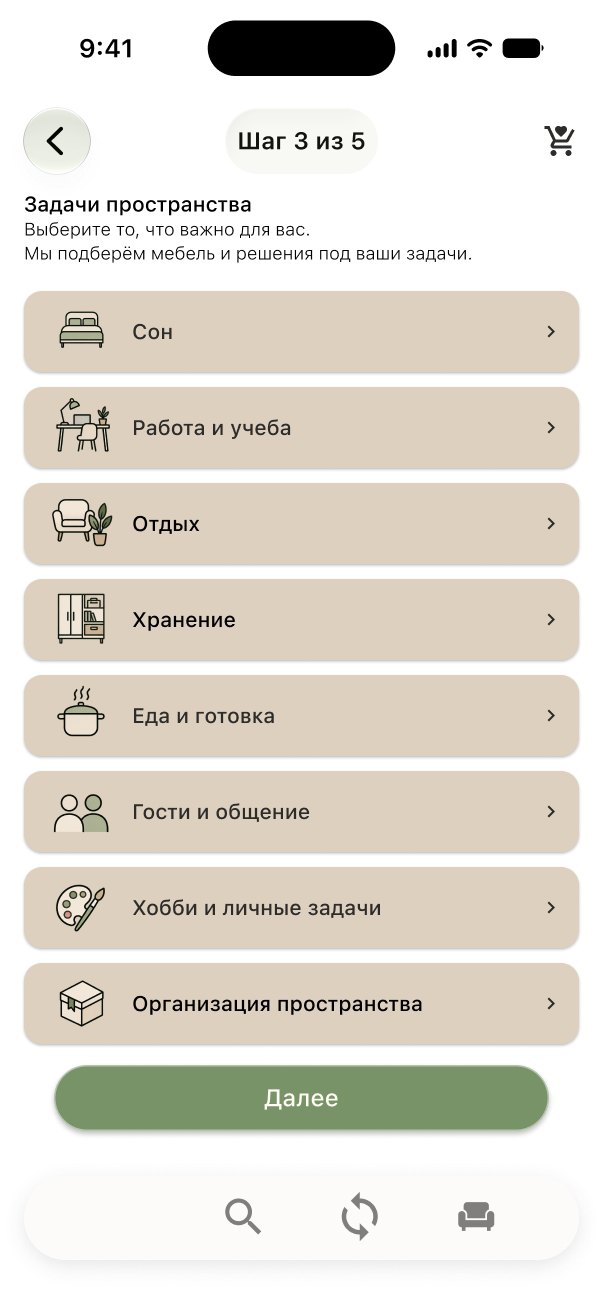
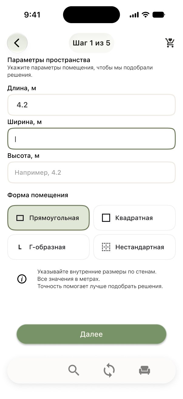
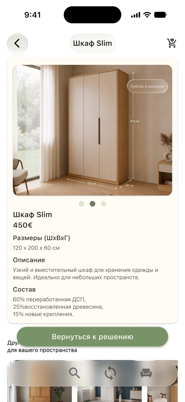
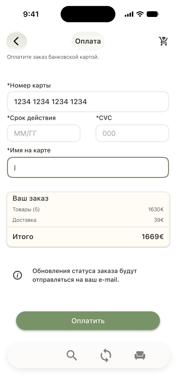
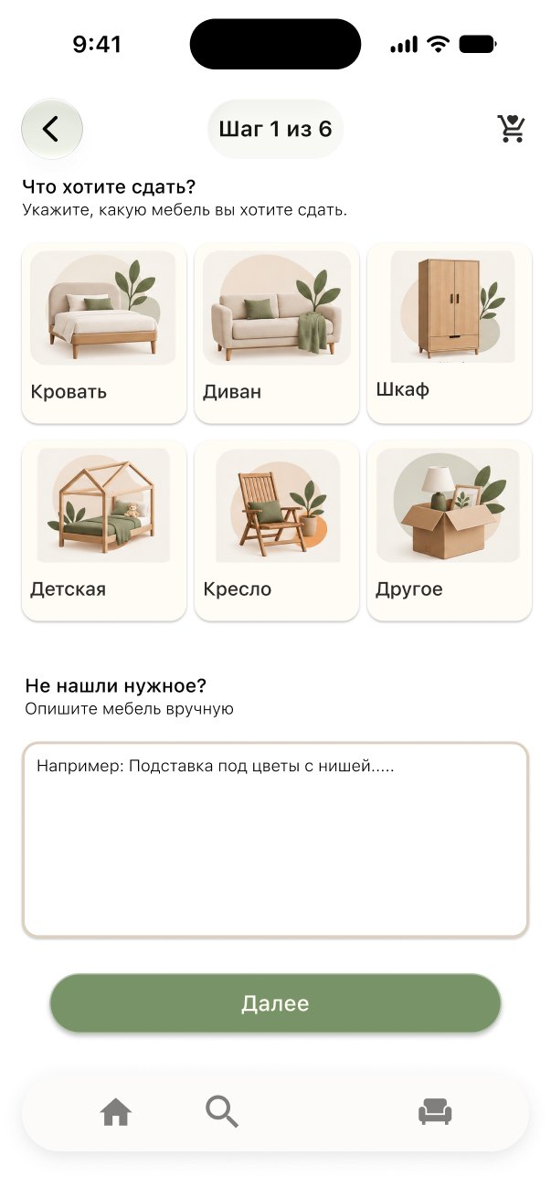
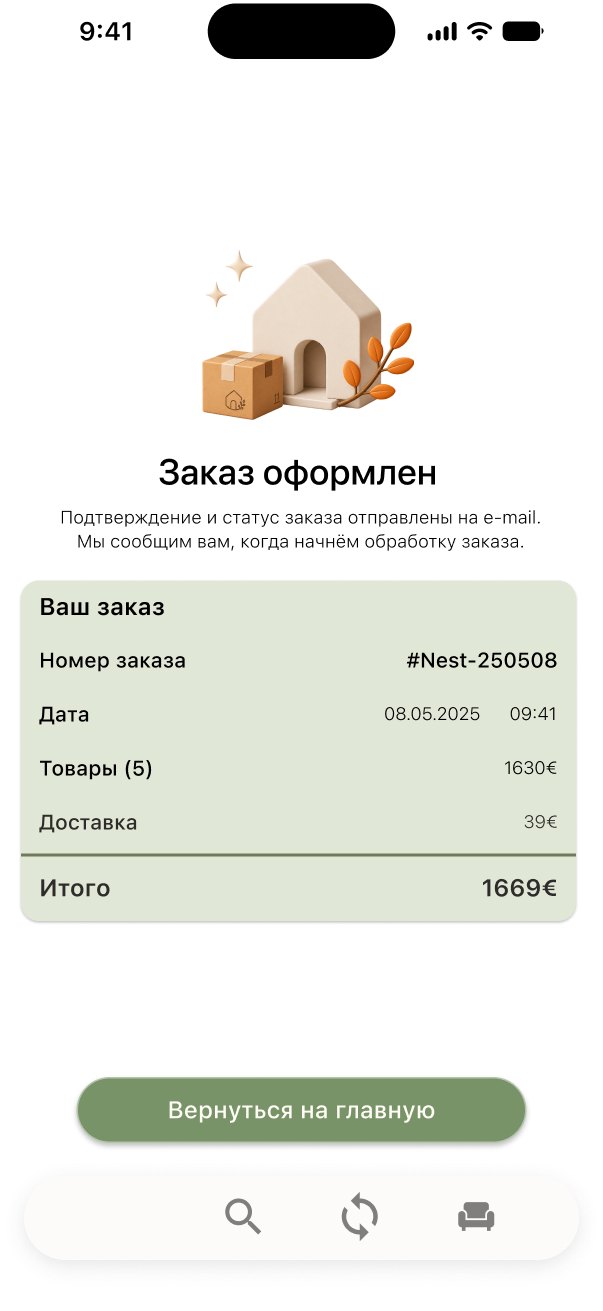
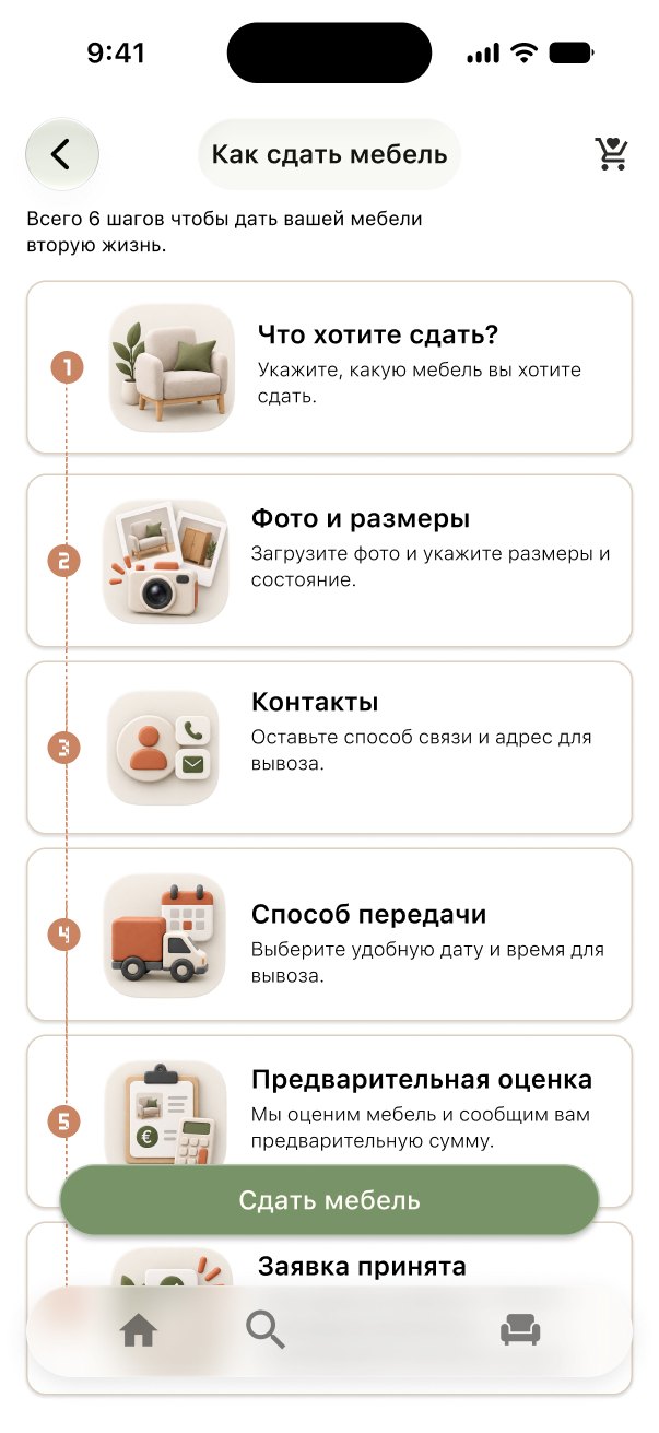
Four decisions
that simplify the path.
No sign-up
The whole journey - from selection to an order or request - works without creating an account.
Needs first, not products
Instead of searching for products, the user picks functions: sleep, work, storage, rest.
Ready-made set
NEST puts furniture together based on the room size, needs and budget.
Furniture cycle
Unwanted furniture can be returned through Nest Loop - for restoration or recycling.
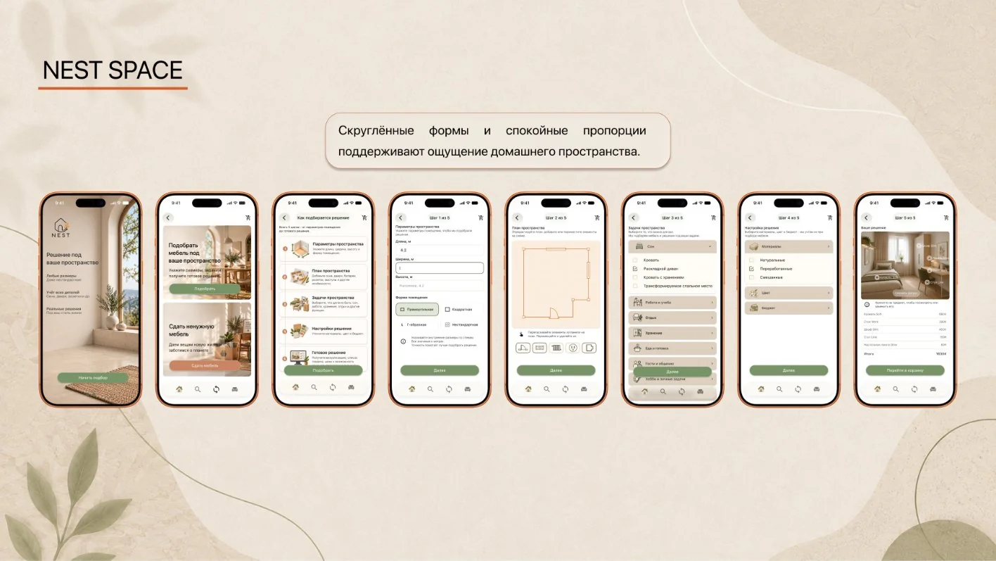
Rounded shapes and calm proportions - the feeling of a home.
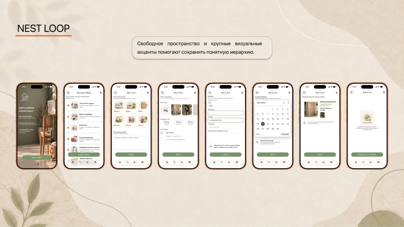
Not just disposal - bringing furniture and materials back into the cycle.
What's next.
MVP
Quick furniture matching without sign-up.
NEST Personal
A personal account and saved spaces.
Smart NEST
Room Scan, AR and 3D try-on.
Custom · Passport
Solutions for unusual spaces and a life history for every piece.
What I took away
from the project.
Cutting a big concept down to an MVP without overloading the app with features.
I dropped the "catalogue → product" logic and built the flow around the user's need: space → needs → solution.
Good UX isn't about the number of features - it's a clear path to the result.