DB Navigator
From Hamburg to Berlin: the path to a clearer ticket.
Research into the problems users face when searching for routes and buying tickets in the Deutsche Bahn app - and hypotheses on how to make that path simpler.
Millions of trips a day - and one screen where it's easy to make a mistake.
The official Deutsche Bahn app is the key service for travel across Germany and Europe. It does everything:
Two passengers,
two fears.

"I need a decision in 30 seconds."

"I just want to be sure I'm on the right train."
"17 minutes -
is that enough?"
I traced Ali's journey from searching for a route to the trip details and recorded his thoughts and emotions at every step. The most stressful moments were prices without explanations and short transfers.
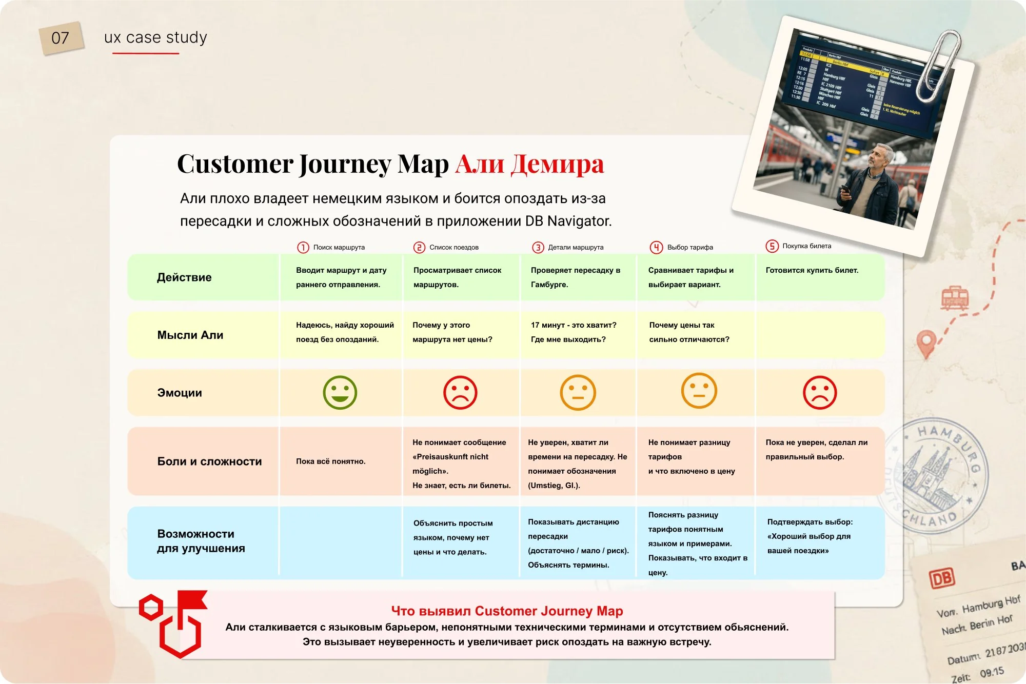
Prices without explanations
A wide spread of fares, but it's unclear how they differ.
Price unavailable
"Preisauskunft nicht möglich" - unclear whether it's an error, sold out, or the price will appear later.
Language barrier
German terms (Umstieg, Gl.) cause stress.
Short transfers
Unclear whether there's enough time and where the right platform is.
If… then…
because.
Too many route options
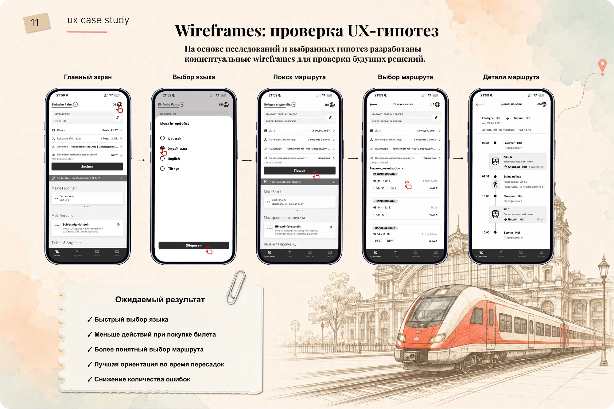
Highlight a recommended route with "Fastest", "Cheapest" and "Best" labels - decisions are made faster.
Unclear terms and icons
Add simple explanations right on the route screen - fewer mistakes and less anxiety.
Fear of missing a transfer
Show the route as a step-by-step diagram with transfer times - the path is clear in advance.
Too many actions
Put fare, class and passenger details on one screen - faster to checkout, no going back.
Language barrier
Multiple languages and quick switching - international users complete tasks more successfully.
Learning from those
who keep it simple.
Mopla - easy travel pass purchase. FlixBus - clear search and route choice. What to bring into DB Navigator: showing the price earlier, highlighting the best option, compact cards.
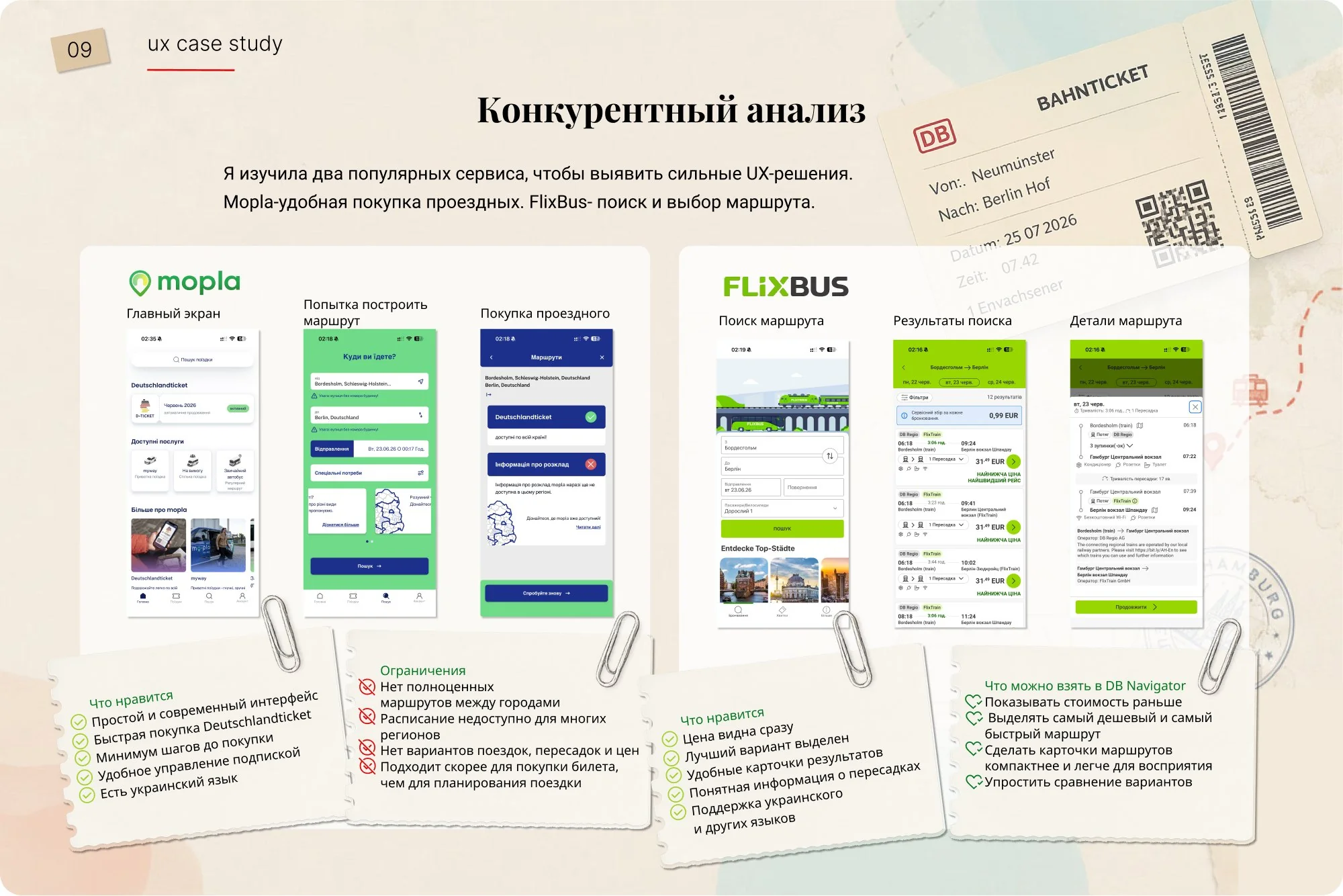
One task -
two apps.
"Find and book a ticket from Hamburg to Berlin for 21 July." One user completed the task in both apps.
DB Navigator
FlixBus
"It's handy that you can pick the time right on the first screen." - about FlixBus
A concept
of future solutions.
The main challenge is
not finding a route,
but making sense of it.
Competitive analysis, CJM, personas and the usability test all showed the same thing: DB Navigator can do everything, but it's overloaded. A complex interface, a single language and extra steps get in the way of simply buying a ticket.
Fewer steps, clear language and visible transfers will make buying a ticket faster and calmer.
Language barrier
strongly affects the user experience
Recommendations
matter more than comparing dozens of options
Number of actions
directly affects satisfaction
Route visualisation
reduces anxiety at transfers